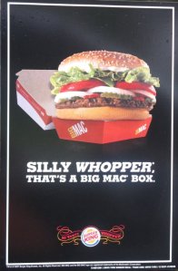
Analysis 2: Burger King- Comparision and Contrast. Lauren Heideman and Kierstin Schuch
Burger King. Advertisement. 26 Jan. 2010: http://www.chrisd.ca/blog/1782/burger-kings-clever-new-whopper-ad/
This ad is a strategy of comparison – contrast because it compares Burger King to McDonalds. The purpose of this is to inform people about the whopper from Burger King. Another purpose is to persuade people to choose Burger King over McDonalds. The intended audience would be anyone who likes fast food. It might not really be intended for kids because normally kids want a smaller size meal. The intended audience is adults who are looking to get the most for their money. The style of this ad is informal because there is a short sentence and just a picture. The context of this ad is for people who are aware of fast food and people who know of Burger King and McDonalds. The genre of this is an advertisement. This ad uses ethos by showing the whopper in the picture. It also shows the whopper being bigger than the Big Mac box meaning the Big Mac is smaller than the whopper. This ad uses logos by also using the fact that the whopper is bigger than the Big Mac box. This ad uses pathos by saying the whopper is bigger which makes people want it because they like it more. The funny line that goes with it might make people feel that they will side with the whopper. There are logical fallacies in this advertisement. The company could have made the box bigger or the whopper bigger than it is in real life. This ad is effective because there are people out there who want what is bigger. If a person saw this ad while they were trying to decide between McDonalds or Burger King, they would probably pick Burger King and get the whopper. It may not be effective too because people have their own mind made up which is better.

Leave a comment